This collection consists of seven designer exercises created as part of my Spring 2025 Design Team II class. We were tasked each week with watching a presentation created by one of our peers on a designer of our choosing. We then had to create an original piece inspired by the style of that designer. This series of designer exercises was quite fun to make, as I challenged myself to create versions of the covers of my favorite albums in the style of the artists that my peers presented.
Lady Gaga - "The Fame" & "The Fame Monster" in the style of Cyrus Highsmith
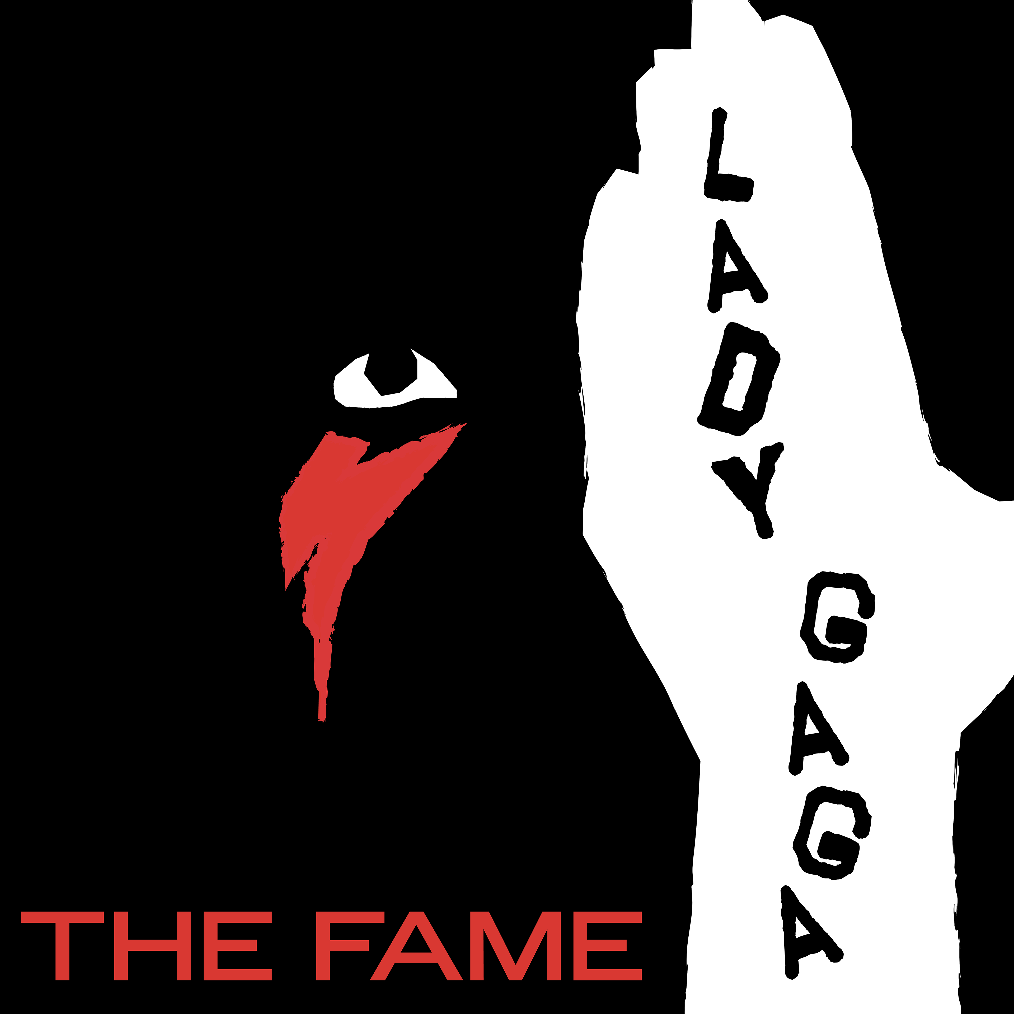
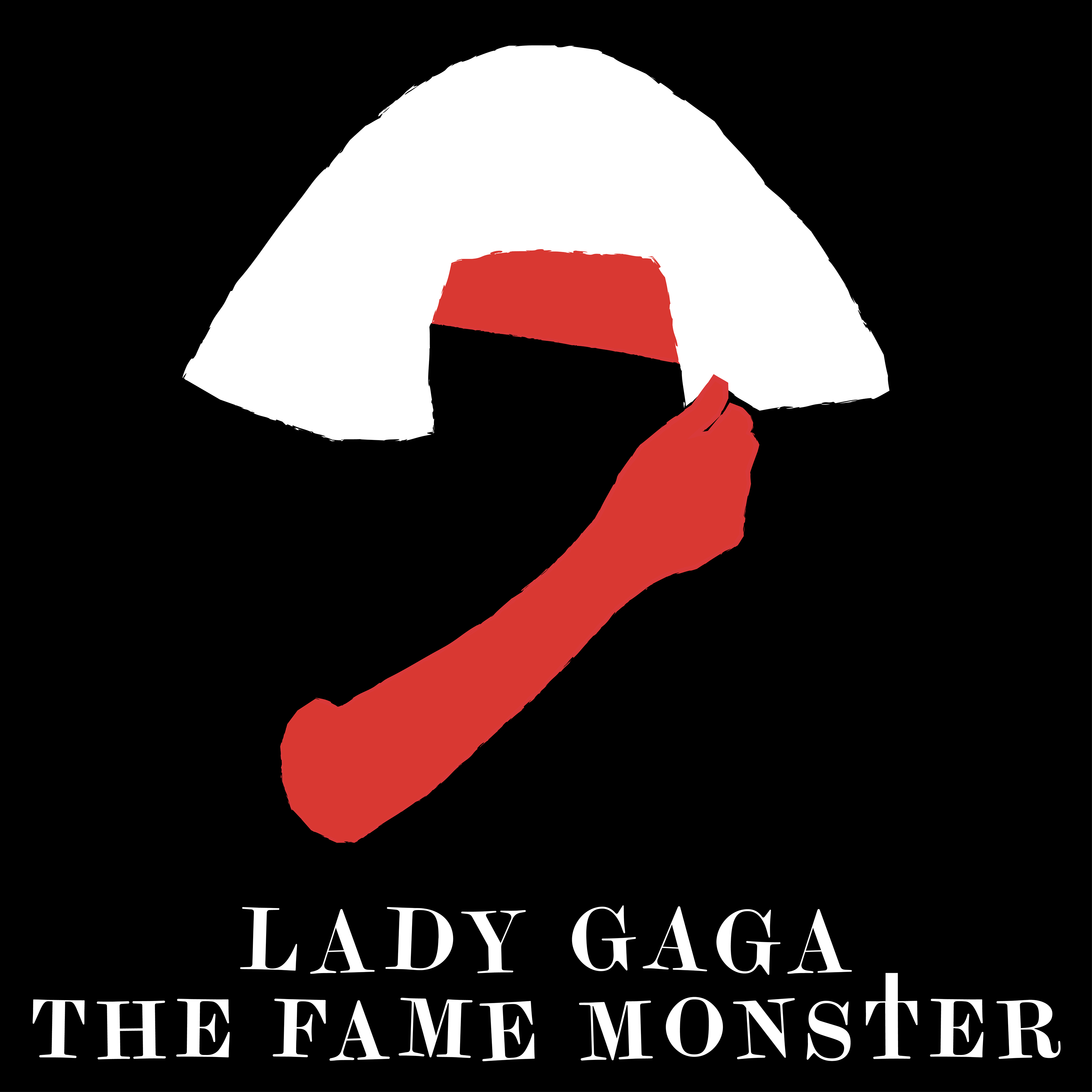
For the very first piece I made as part of this collection I was tasked with creating a piece in the style of talented graphic artist/typeface designer Cyrus Highsmith, creator of Occupant Fonts. After searching for and going through the many wonderful works of Highsmith, I found the inspiration that I needed to begin creating my design, or I guess you could say designs, as I couldn't stick to just one album for my first album cover redesign. I chose to do both The Fame and The Fame Monster, Lady Gaga's first two albums, which I hold both close to my heart.
There were a few pieces from Highsmith that provided most of my inspiration for my pieces, with this work by Highsmith providing inspiration for the color palette, as well as this work providing further inspiration. I created two pieces that use negative space to their advantage to create striking imagery where only the most important parts stand out. In The Fame's reimagined cover, this is Gaga's iconic David Bowie-inspired lightning bolt beneath her eye, and in The Fame Monster's reimagined cover, this is her arm covering her face along with her iconic hair.
For the text I was inspired by other Cyrus Highsmith pieces that featured unique useage of text, with the text being somewhat scattered and tilted in certain instances. I took this inspiration and applied it to my pieces.
For the first two designer exercises that I created I am very happy with these two pieces. They stand out from the rest of the pieces and are dedicated to one of my favorite musical artists.
Lana Del Rey- "Honeymoon" in the style of Jessica Hische
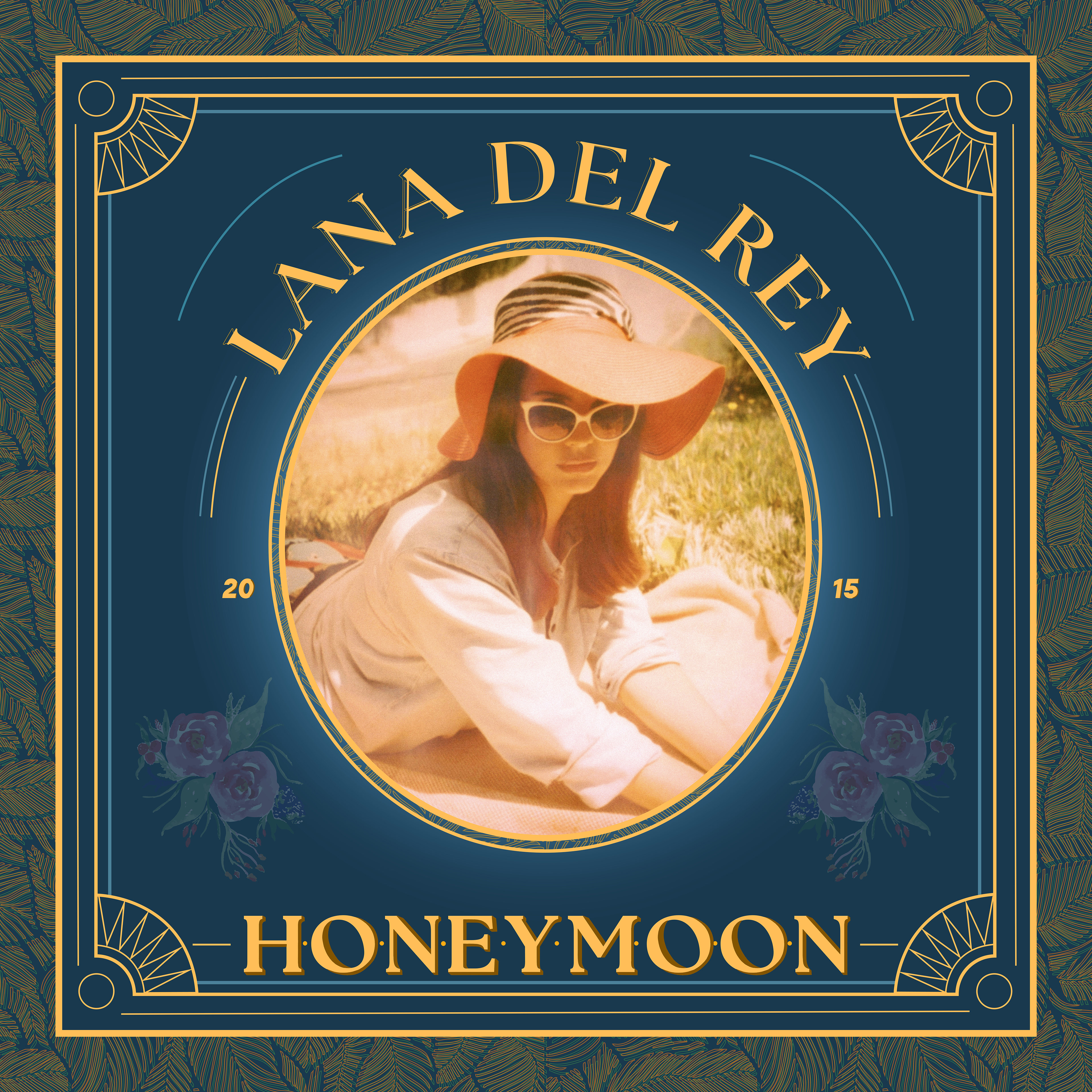
I chose Lana Del Rey's album Honeymoon as the second album cover that I would recreate. This is one of my favorite albums from one of my favorite artists so I was quite excited at the opportunity to create a version of its cover in the style of Jessica Hische, a talented graphic designer who works mostly with typography.
My piece was inspired by Hische's "Dolly Parton Cover", where I mainly drew inspiration from the way in which the image of the artist was stylized, as well as the floral/plant-like pattern surrounding the edge of the piece. I quite enjoyed the process of creating this work, with most of the designing and creation being completed in Illustrator, with editing of the image of Lana Del Rey taking place in Photoshop, and with some various details on the "Honeymoon" lettering being done in Procreate.
I am absolutely in love with how this piece turned out. I made sure to pay homage to the original Art Deco style of the original Honeymoon cover, with Art Deco-inspired elements being a commonplace motif in the visuals surrounding that album. This Art Deco influence was included in the various line work details, as well as the color palette. I used darker, fancier-feeling colors to further strengthen the more upscale 1920s Art Deco feel.
Charli xcx - "brat" in the style of Tori Apiradee (also known as Tori.PNG)
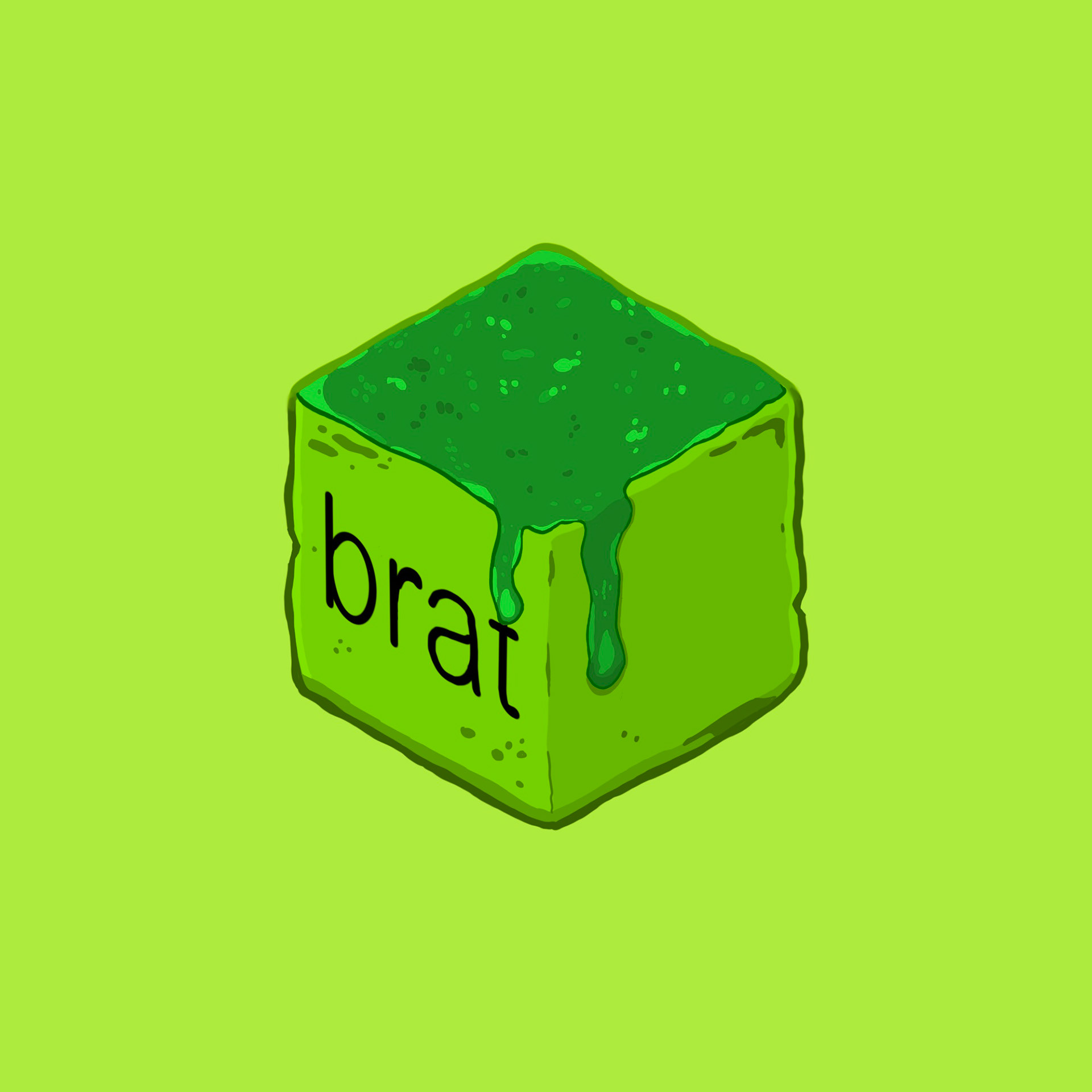
For this piece, inspired by the Food Cubes collection from the unique and talented graphic artist Tori.PNG, I chose Charli xcx's 2024 album "brat". This album was one of my favorites from 2024 from both a music perspective and a graphic design perspective. The album's artwork consists of the word "brat" in black, lowercase Arial font, in a rather low quality, pixelated format. The entirety of the rest of the cover is the now internet-iconic "brat green", a rather violent and neon shade of green. I was quite excited at the idea of turning this very plain-looking album cover into a delicious-looking food cube.
I created the entirety of this brat-cube in Procreate, illustrating the entire thing by hand. I took great inspiration from the illustration style of Tori's other food cubes which proved to be quite the fun task! I had a lot of fun experimenting with a more illustrative style, as most of the designs I create don't incorporate much actual illustration, which is something that I'd like to do more of in the future.
Björk - "Post" in the style of Rogie King
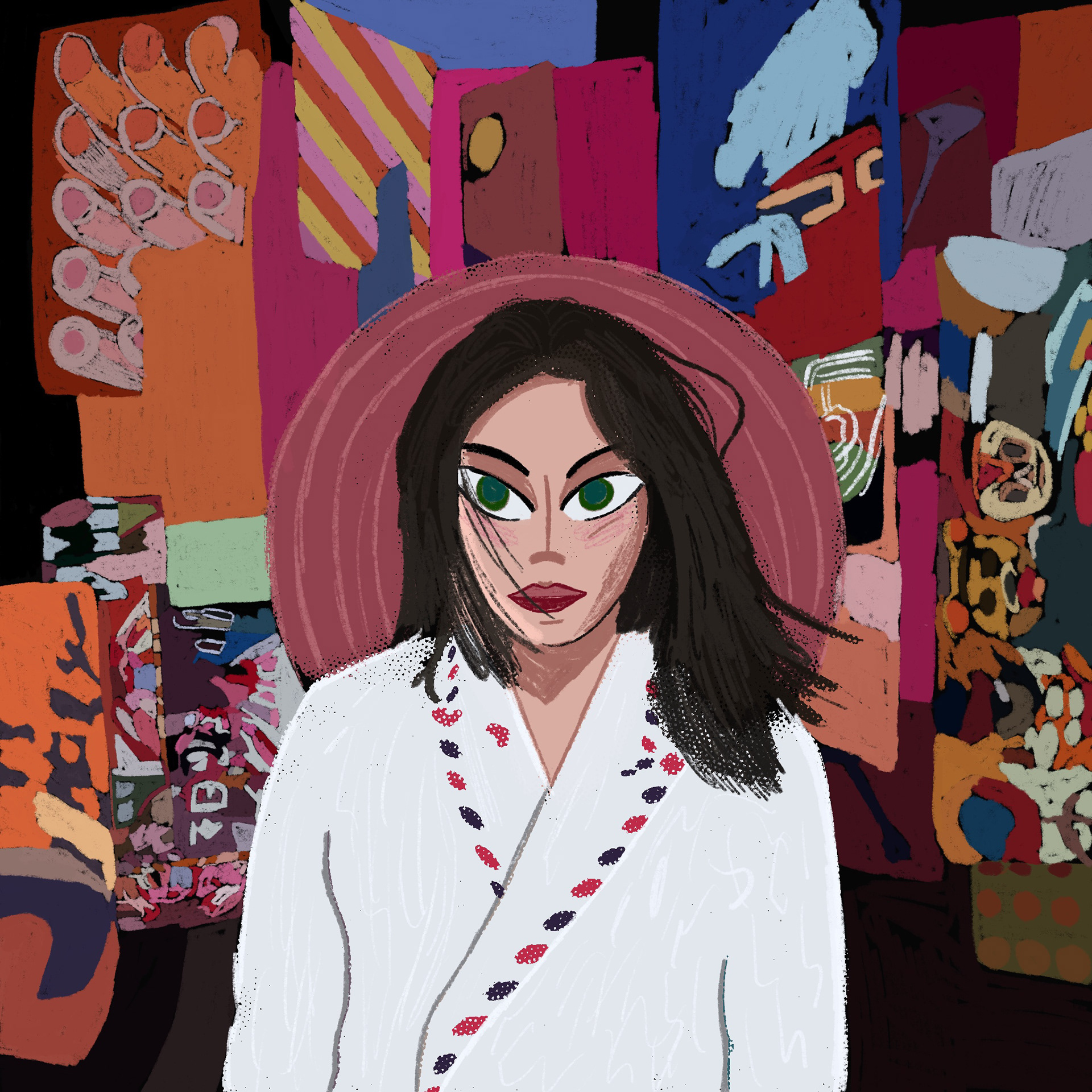
I chose Björk's 1995 album "Post" for this piece inspired by talented graphic designer Rogie King. I chose this album as I wanted to continue a little tradition that I had with my design projects during my time at Johnson & Wales University where I'd incorporate my Icelandic queen somehow into my designs. This integration is, well, a little more obvious than others. I also love this album and the original cover and loved the opportunity to apply King's unique illustration style to this cover.
I took majority of my inspiration for this piece from this particular creation by King. I enjoyed the uniqueness of this character's eyes, and how they overlapped slightly with her hair. I applied this same effect slightly to my design, which I illustrated fully in Procreate. I also tried to apply a similar textured-affect to my illustration. I experimented with different brushes to try and get this affect.
The hardest and most time-consuming part of creating this illustration was the background. While I wanted to keep the background a little more simple to keep it more-so inline with King's style, Post has quite a bit going on in the background. I powered through however and created a design that I am so incredibly proud of! It's one of my favorites in this entire collection.
Lady Gaga - "Mayhem" in the style of Swoop Nebula
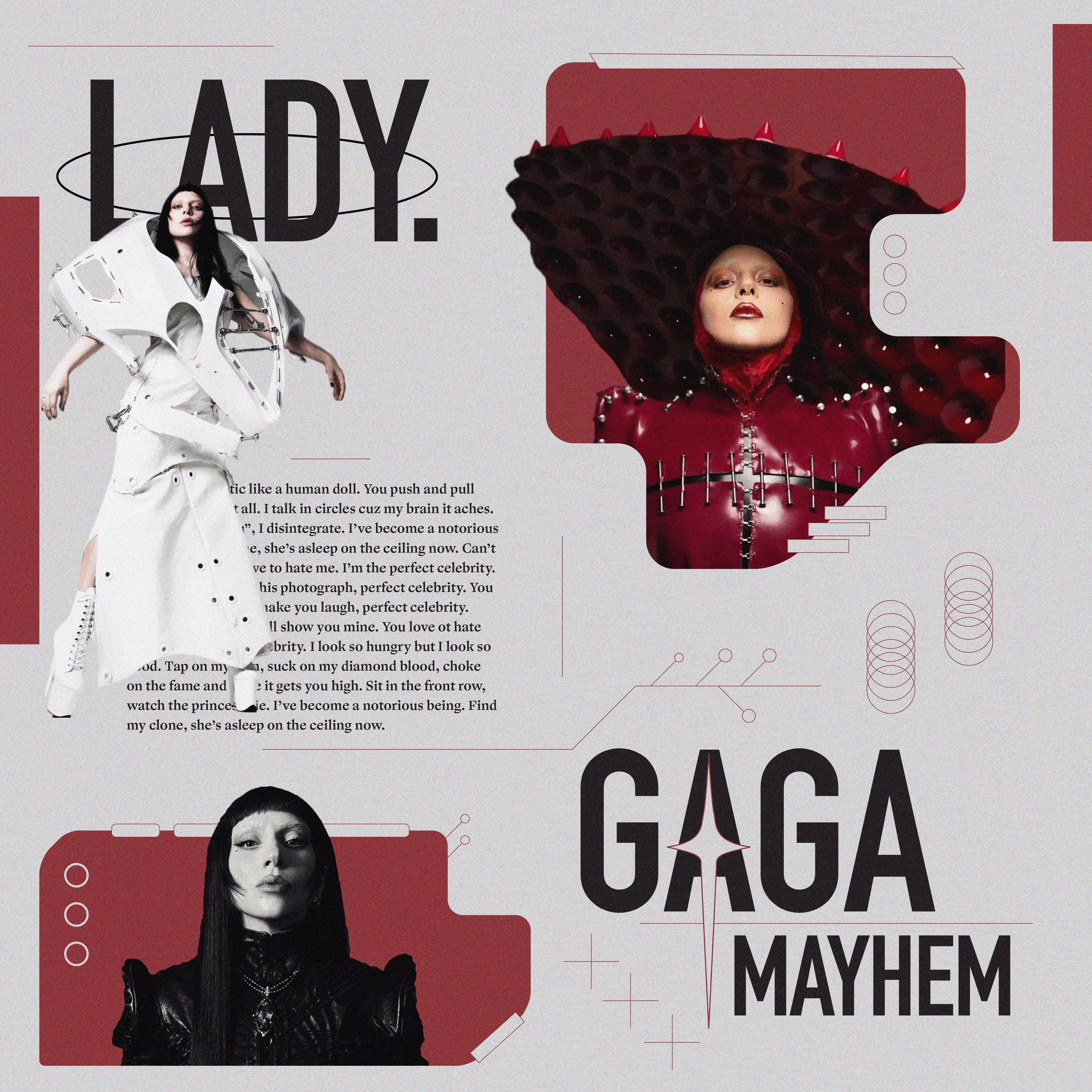
Inspired by the incredibly diverse and great work of graphic designer Swoop Nebula I reimagined the cover for Lady Gaga's Mayhem to better fit Nebula's fun and unique style, in particular the style of his "Rap Poster Series". What inspired me most about this series of designs were the unique combinations of shapes, imagery, and effects which all worked together to create a modern, almost space-age feeling design. This style of design is something that I had so much fun working with and I thoroughly enjoyed imagining Gaga's Mayhem in this style.
I created this piece, like majority of the others in this collection, in Illustrator, with some slight editing to the photos of Gaga done in Photoshop, as well as applying a grain filter to the entire design once finished in Photoshop. I had a lot of fun placing the different shapes around the canvas, such as the overlapping circles, lines, and squares. While they all may seem random, they all come together to create a cohesive piece. As for the text on the cover, the posters in Nebula's Rap Poster Series feature blocks of text containing lyrics from the artist featured. I continued with this design detail by using the lyrics of Perfect Celebrity, one of the songs off of Mayhem, on the cover.
This piece is probably my favorite out of all 7 of the pieces in this collection. I love the dimension that it has, with the original inspiration giving me the idea to continue with this dimensionality, with the images, particularly the one of the "Lady in Red" (top right of the cover) with her hat popping out on the left of the red shape she's contained in. Make sure to check out the rest of Swoop Nebula's Rap Poster Series, as well as the rest of their great work!
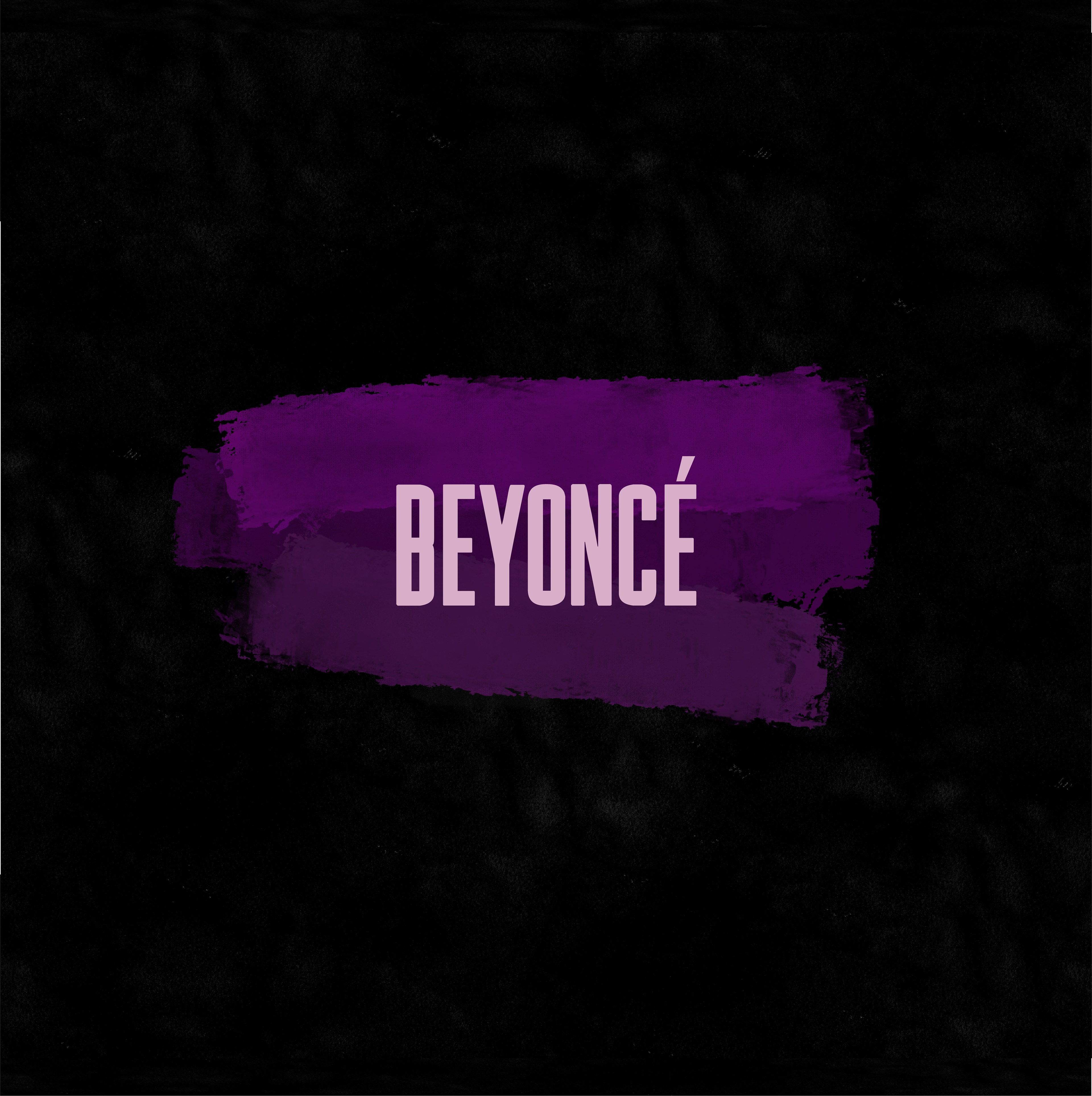
Beyoncé- "BEYONCÉ" (aka "Self Titled") in the style of...an unknown artist

For the final piece in my designer exercise collection I chose Beyoncé's 2014 album "BEYONCÉ", commonly known as "Self Titled". I chose this as I went through a mini Beyoncé-renaissance (no pun intended) around the time of the creation of this designer exercise, where I was listening to a lot more of her music after seeing her on tour. Similar to Charli xcx's "brat", this album cover is very simplistic in nature. The cover features an all-black background with "BEYONCÉ" written out in all-caps Knockout font, with a light-purple/pink color.
For my version inspired by the mystery-designer, I kept the minimalistic aesthetic of the original cover alive, albeit with a the twist of including a few dark purple paint strokes below where the "BEYONCÉ" text would go. While I may not be able to remember who I took inspiration from for this design, I do remember that paint-like strokes were prevalent in some of their work. The paint strokes were created in Procreate, with the design being imported into Illustrator where I added the text.
This piece is one of my favorites in the collection, as my design doesn't stray too far from the original album cover, but still incorporates a unique element inspired by a fellow graphic artist. I also just really like the shades of purple I chose for the paint strokes, as I made sure that they'd be slightly different to create more dimension.
When I am finally able to recall who this piece was inspired by, I will be sure to update this entry accordingly.
Final Thoughts
Overall, I'm very happy with this entire collection. As far as assignments go, this was quite the fun assignment as not only did we have full creative freedom over what kind of artworks we created, we were also given the lovely chance to learn more about fellow graphic artists and designers and see more of their work.
Creating designs for the fun of it is something that I'd love to get into more and to share more on my website and my Instagram. Make sure to check out the work of the talented artists that my pieces were inspired by, I've made sure to link their profiles and websites in the artwork sections above.
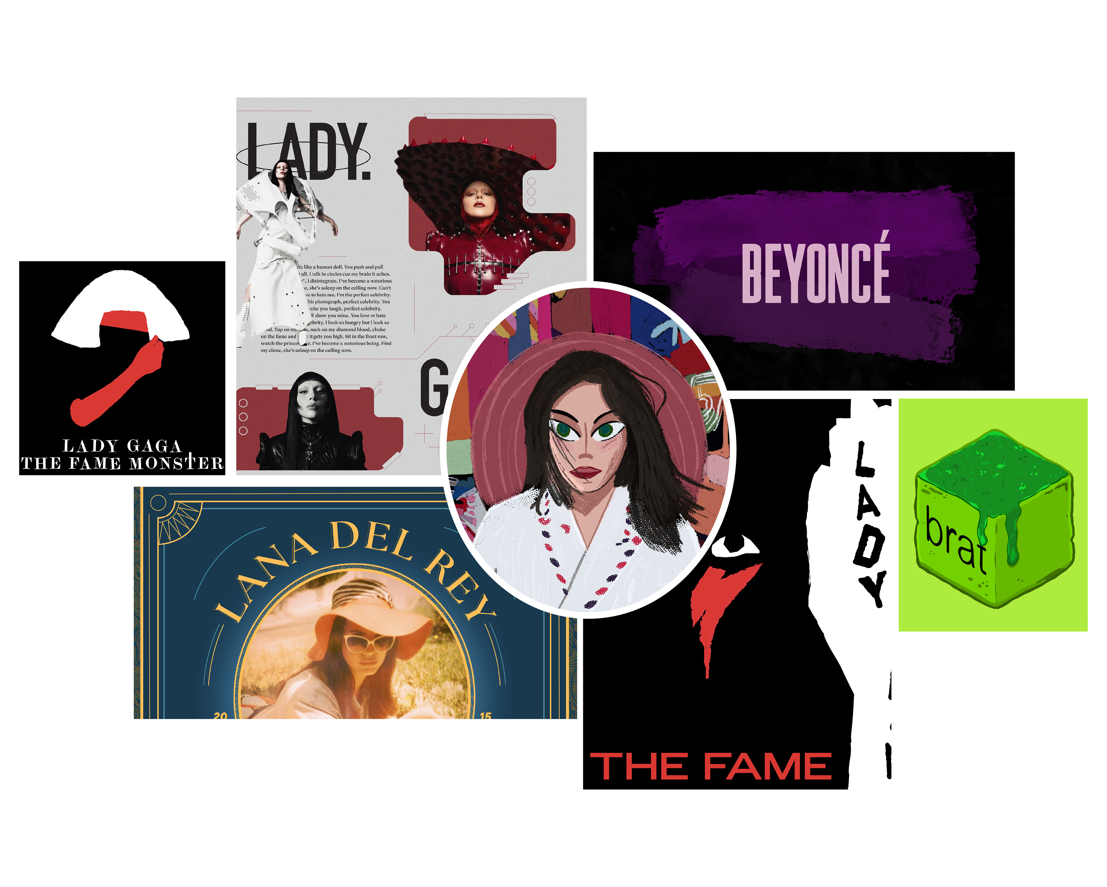
Final Collection